GUI Tree Elements
You can add the components that are used on the macro page via the Create New Element button on the toolbar.
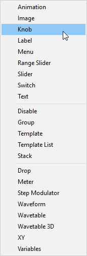
- Animation
-
Allows you to display animations or graphical option menus on your macro page.
- Image
-
Allows you to add bitmaps in the formats .png and .bmp.
- Knob
-
Allows you to create potentiometers by using a bitmap or a section with frames. These frames will be played as an animation when turning the knob.
- Label
-
Allows you to display text for knobs, text fields, or sections. This text is defined once and cannot be edited on the macro page. To insert editable text, use the Text element instead.
You can either use one of the available system fonts or use your own fonts for more decorative text styles.
- Menu
-
Allows you to create switches that open a menu. This menu is filled with the values that are delivered by the connected parameter. The menu also provides an option to open a tree menu, which is helpful when the element contains a large number of values.
- Range Slider
-
Allows you to add a range slider. This is similar to the Slider element, but it is used to work on a specific range that is defined by minimum and maximum values.
- Slider
-
Allows you to create a variety of different slider types. You can choose between horizontal and vertical sliders, let the slider jump or move to the click position, etc. Sliders can use a background bitmap that can also be an animation.
- Switch
-
Allows you to create different types of switches. By specifying a Mode, you can configure the switch as an on/off switch with two states, as a multi-state switch with an arbitrary number of states, you can create exclusive switches that can act as a radio group, etc. The switch requires several bitmaps, depending on the set Mode and can be set to Scalable, which allows you to resize the switch. In this case, the bitmaps are resized according to the set Scale Mode.
- Text
-
Allows you to add editable text to your macro page.
- Disable
-
Allows you to add a special group that can disable all its child controls.
- Group
-
Allows you to add a group that serves as a container for controls and templates.
- Template
-
Allows you to add an instance of a template to the GUI Tree.
- Template List
-
Allows you to add a list that can contain multiple instances of a referenced template.
- Stack
-
A stack allows you to create pages or sections on a macro page between which you can switch. Each child of a stack is shown exclusively, depending on the value of the stack. For example, you can control stacks using radio switches, by providing one switch per stack view.
- Drop
-
Allows you to add a control that accepts dropped objects and returns information such as the file name and path of a sample file, for example.
- Meter
-
Allows you to add meters that can display the value of a parameter.
NoteFor audio metering, use the Bus Meter template instead.
- Step Modulator
-
Allows you to add a control with up to 32 editable bars.
- Waveform
-
Allows you to add a waveform display to show sample waveforms.
- Wavetable
-
Allows you to add a display showing the waveform output of a wavetable oscillator.
- Wavetable 3D
-
Allows you to add a display that shows a wavetable as a three-dimensional image.
- XY
-
Allows you to add a two-dimensional control, where the position of a point in a field controls two parameters.
- Variables
-
Allows you to add a folder in which you can add variables.
If a Variables folder was added, you can select the available variables from the Variables submenu.