Edit Composite Component dialog
You can create custom components and edit existing components for both individual chord symbols and for project default chord symbols in the Edit Composite Component dialog.
You can open the Edit Composite Component dialog by clicking either Add Component or Edit Component in the alternative component presentations action bar in the following dialogs:
-
Project Default Chord Symbol Appearances dialog
-
Edit Chord Symbol Appearance dialog
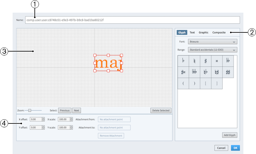
Figure: Edit Composite Component dialog
The Edit Composite Component dialog contains the following sections:
-
Name
Contains an automatically generated name for the chord symbol component. You cannot change this name.
-
Component selector
Allows you to choose components to add to your chord symbol component. You can add different types of components by clicking the respective tab titles.
-
Glyph, for example, ♮ or ♯. You can use different styles of glyphs by selecting different fonts and different ranges from the menus. Click Add Glyph to add the selected glyph to the chord symbol component.
NoteA full list of the different ranges of glyphs is available on the SMuFL website.
-
Text, including numbers and other text. You can use numbers and text from the available Preset text list, or select any font available from the menu and enter your preferred text into the text box at the bottom. Click Add Text to add the selected text, or input text, to the chord symbol component.
-
Graphic: Allows you to load a new graphic file, or select an existing graphic from the Select existing list. Most image formats are supported. You can see a preview of the graphic in the Preview box. Click Add Graphic to add the selected graphic to the chord symbol component.
-
Composite: Allows you to select a composite from the list. Click Add Composite to add the selected composite to the chord symbol component.
-
-
Editor
Allows you to arrange and edit the components that make up your chord symbol component. You can arrange and edit components using the controls at the bottom of the dialog.
-
Controls
-
X offset moves components horizontally. Increasing the value moves components to the right, decreasing the value moves components to the left.
-
Y offset moves components vertically. Increasing the value moves components upwards, decreasing the value moves components downwards.
-
X scale changes the width of graphics only. Increasing the value makes graphics wider, decreasing the value makes graphics narrower.
-
Y scale changes the size of components. Increasing the value makes components larger, decreasing the value makes components smaller. For graphics only, increasing the value makes graphics taller, decreasing the value makes graphics shorter.
-
Attachment from: Select the attachment point on the component to the left of the selected component to which the selected component attaches. We recommend that you select a right edge attachment point for Attachment from.
-
Attachment to: Select the attachment point on the selected component which attaches to the component to its left. We recommend that you select a left edge attachment point for Attachment to.
-
There are eight attachment points for glyphs and graphics, and eleven for text, due to the extra space required for letters that extend below the baseline. The example diagram helps you visualize how these points relate to components.
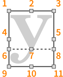
The attachment points have the following names in the Edit Composite Component dialog:
-
Top Left
-
Top Middle
-
Top Right
-
Left Middle
-
Right Middle
-
Baseline Left (text only)
-
Baseline Middle (text only)
-
Baseline Right (text only)
-
Bottom Left
-
Bottom Middle
-
Bottom Right