Control Settings
You can define the control style for switches or knobs to which you have assigned a function. This includes changing the LED ring or changing its behavior, from continuous value representation to on/off, for example.
To open the Control Settings panel, right-click the control.
Not all hardware devices support all control type settings.
Control Type Settings for Knobs
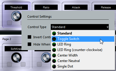
The following control types are available for knobs:
- Standard
A standard knob with undefined LED style.
- Toggle Switch
A knob with 2 states.
- LED Ring
An LED ring around the knob. The setting increases clockwise.
- LED Ring (counter-clockwise)
An LED ring around the knob. The setting increases counter-clockwise.
- Center Width
An LED ring that starts at the top center position, and when the settings increase, an LED is shown growing in both directions.
- Center Neutral
A dial that starts at the top center position and can be moved left or right, like a pan control, for example.
- Single Dot
An LED ring around the knob. The setting increases clockwise with a dot indicating the current value.
Control Type Settings for Switches
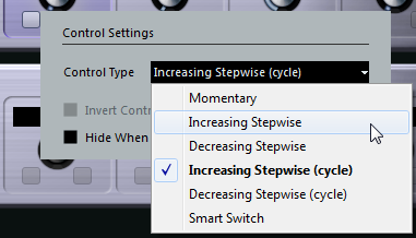
The following options are available for switches:
- Momentary
Activates the assigned function as long as you hold the switch.
- Increasing Stepwise
Steps through the available settings until the maximum is reached.
- Decreasing Stepwise
Steps through the available settings in reverse order until the minimum is reached.
- Increasing Stepwise (cycle)
Steps through the available settings, starting over with the minimum value when the maximum is reached.
- Decreasing Stepwise (cycle)
Steps through the available settings in reverse order, starting over with the maximum value when the minimum is reached.
- Smart Switch
Switches between 2 states every time you press the switch. Enters Momentary mode if you hold the switch.
Invert Control Value
Inverts the control state/value.
Hide When Inactive
Hides plug-in parameters when they are inactive or disabled.